Here are three standout fantasy novel covers that I chose, and what makes them so good:
⸻
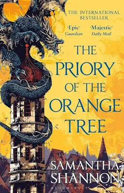
1. The Priory of the Orange Tree by Samantha Shannon
Why it works:
• The cover uses a bold, bright orange-gold background with a dramatic dragon illustration wrapped around a tower. It immediately signals epic scale and fantasy adventure. 
• The illustration was created by artist Ivan Belikov and the design direction by David Mann. 
• The visual composition balances text and illustration well, giving both title and image space to be impactful.
• It sets the tone: dragon lore + regal politics + fantasy world-building.
⸻
2. Ninth House by Leigh Bardugo
Why it works:
• The cover is strikingly simple yet mysterious: a black background with a snake (or serpent-like shape) winding through the title. This minimalism signals darkness, mystery and occult fantasy. 
• The typography is clean, big, and the imagery doesn’t compete but complements the title, which helps with visibility and shelf impact.
• The cover directly reflects the book’s themes of secret societies, hidden power and darkness. The design “fits the story.”
3. The Serpent & the Wings of Night by Carissa Broadbent
Why it works:
• The cover features a dark, moody palette (blacks, silvers, greens) with foil accents and a dramatic title font. The design reflects the fantasy’s tone of intrigue, danger and romantic tension. 
• The packaging and design details (edition designs, special bindings) highlight how much thought went into the physical product and cover as an object of desirability.
• It stands out for showing how cover art can carry emotional undertones (not just epic wars or big monsters but mood, atmosphere) — broadening what “fantasy cover art” can be.
Which covers do you covet?


Leave a Comment
You must be logged in to post a comment.